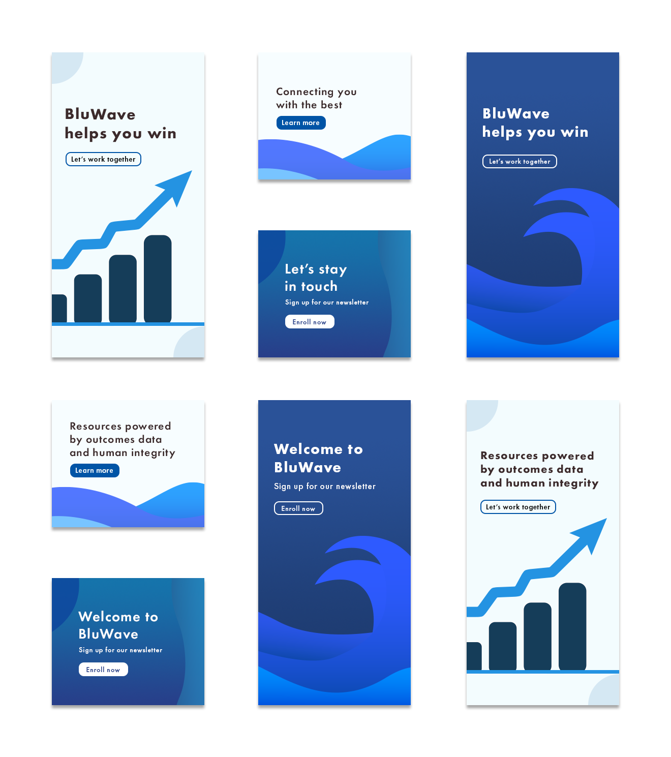
BluWave Project: To create designs of retargeting ads that will capture the essence of what we do in a simple manner and eye-catching manner.
What I did:
I first studied BluWave’s branding and services from their websites. I took inspiration from the website and online examples to create the icons and shapes on Adobe Illustrator.
Colors were chosen and picked based on BluWave’s website and branding. I wanted to give my client the options of a darker color palette and a lighter color palette, as shown above.
The typography was chosen based on its simplicity and how clearly the viewer can read the copy
Trufyx Project: To design two email newsletter templates for their new email marketing campaign.

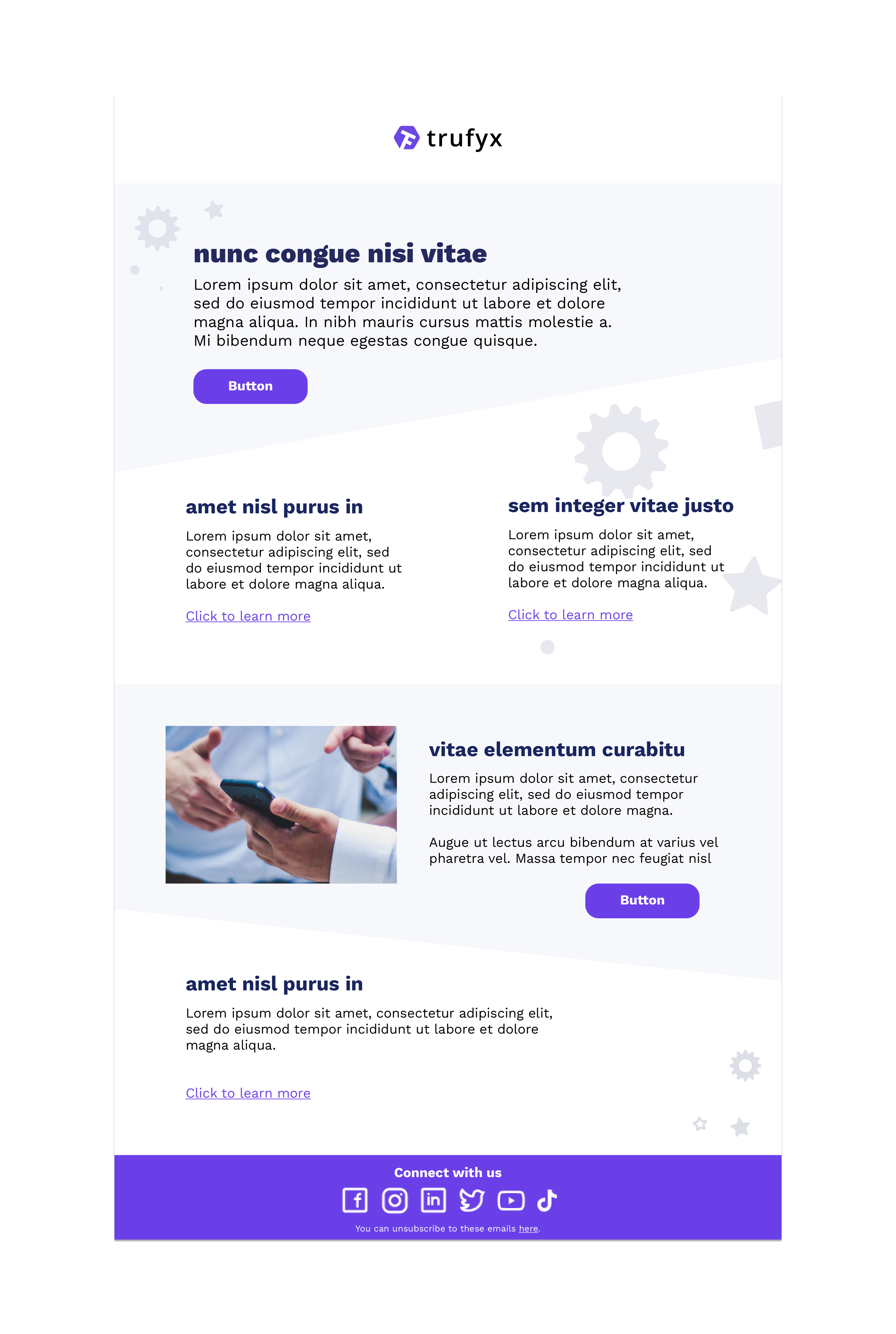
Before this project, I have never created a newsletter design before. So, I started conducting extensive research on creating the best newsletter design. Based on research, I decided to design modules for the newsletter as Trufyx will be communicating information on its products.
The colors were from Trufyx’s website and branding.
The icons and shapes were added from my judgment, based on the research on Trufyx’s competitors and other email designs.
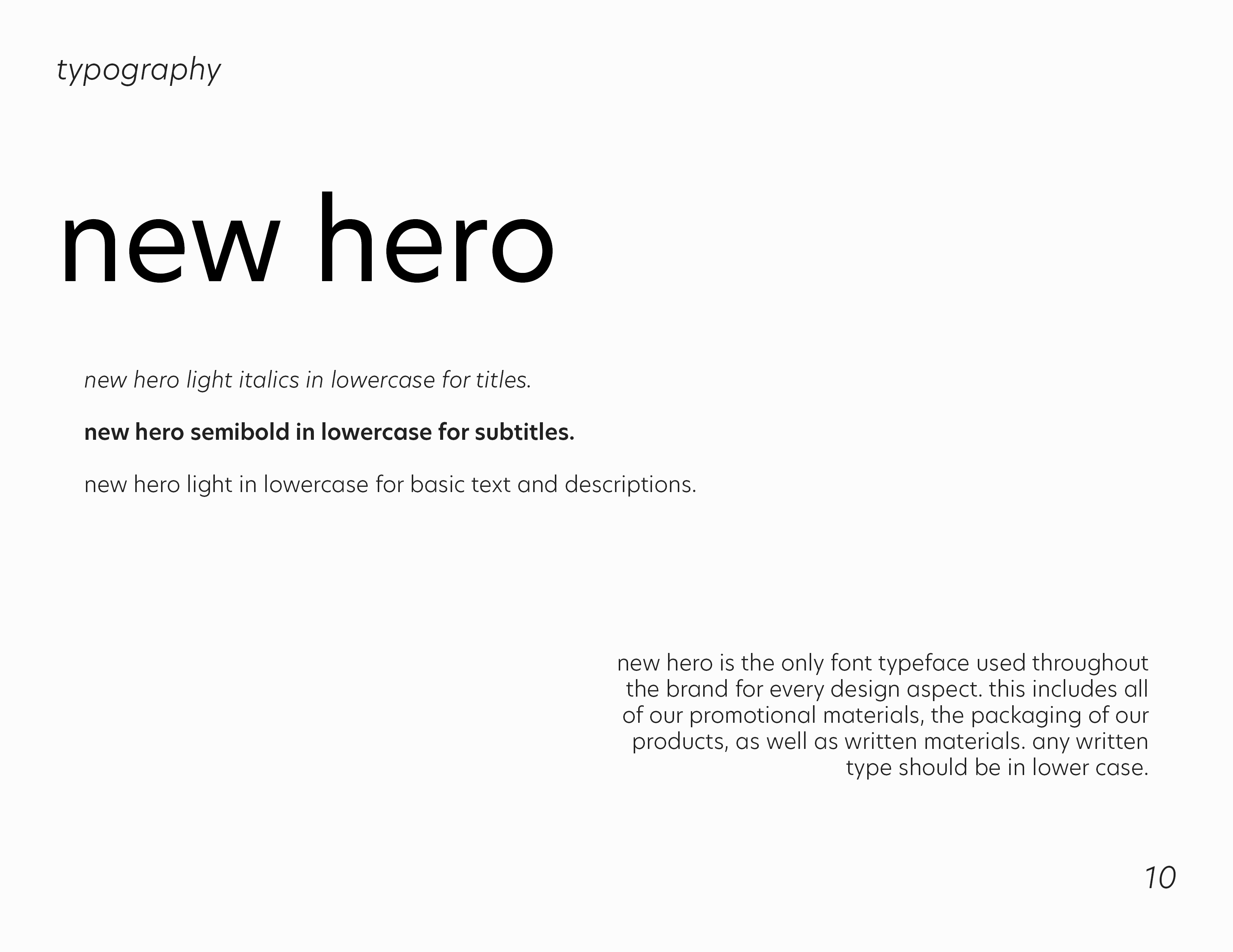
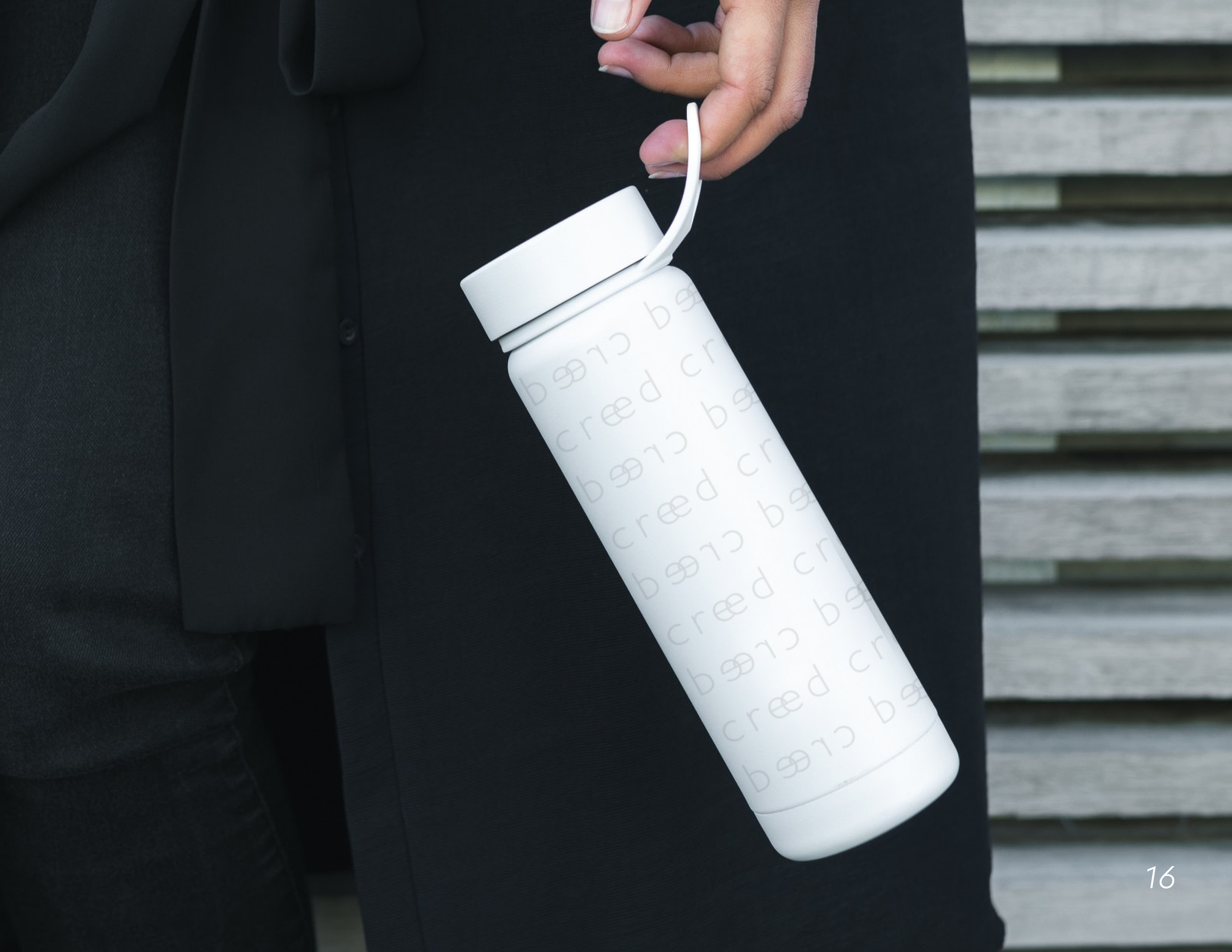
Class branding project: Creed, a women-centered techwear clothing brand





#RideTheWaveWithMOB
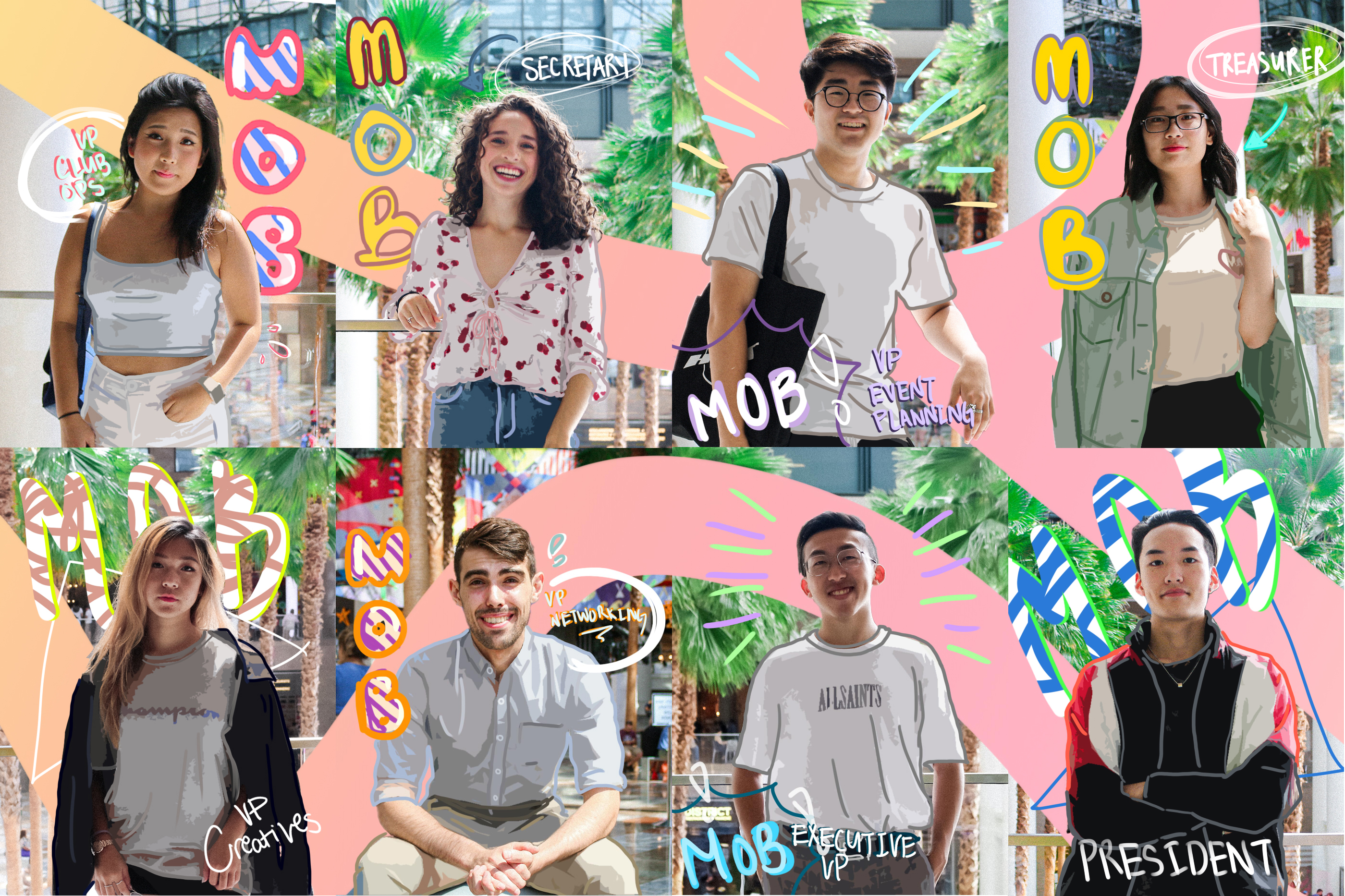

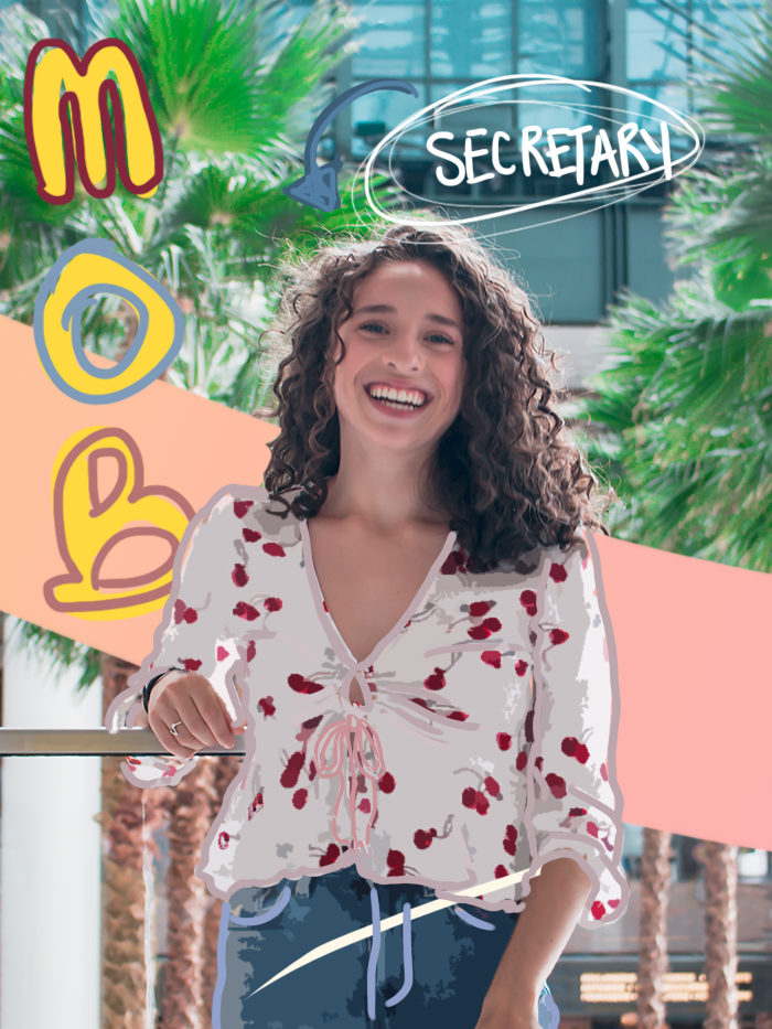
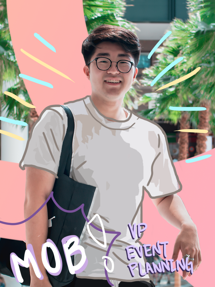
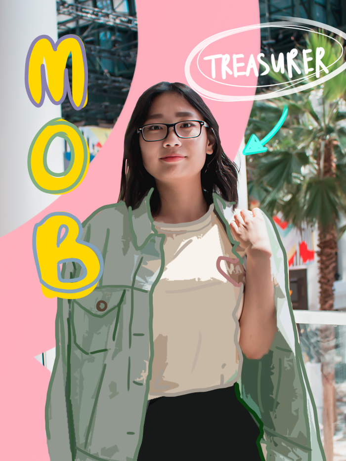
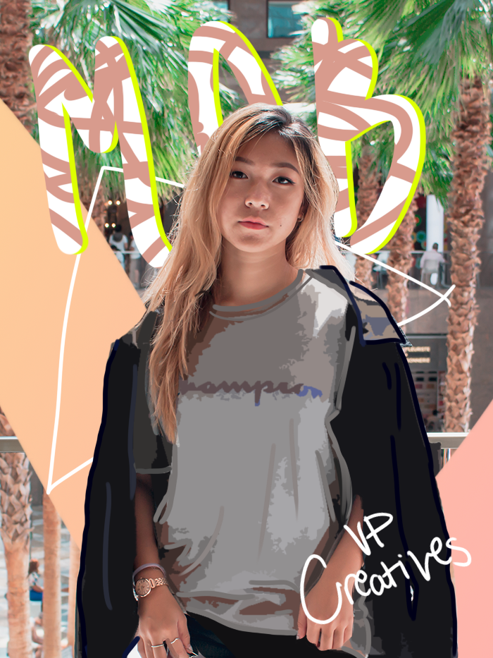
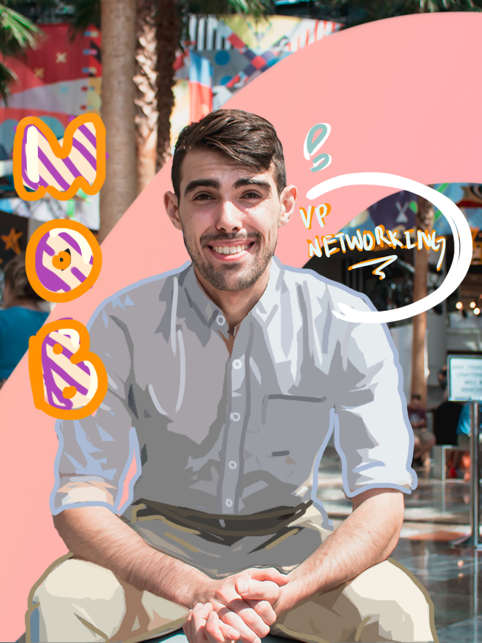
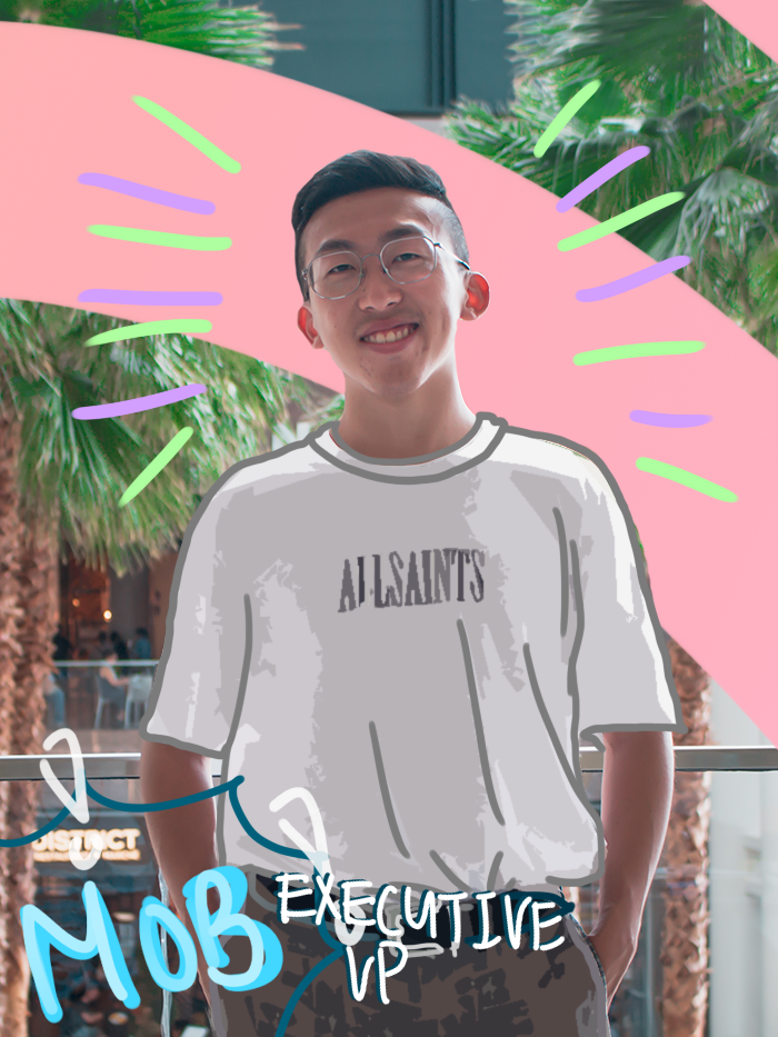
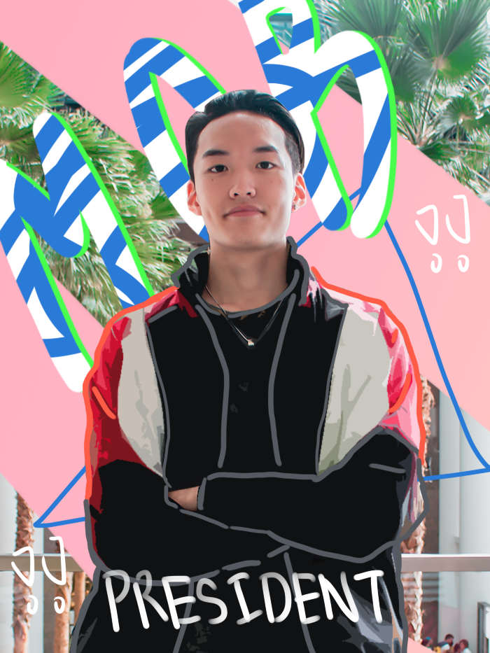
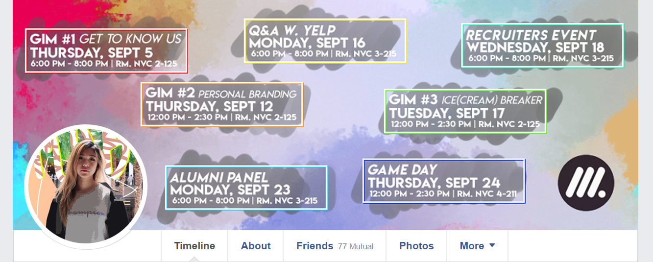
 At the start of the Fall 2019 semester, we started off with the executive board introductions, the aesthetic followed the profile pictures with the “wave” in the background. We posted each graphic on Instagram once a day, minus Friday, Saturday, and Sunday, to gauge which days our followers are most active on.
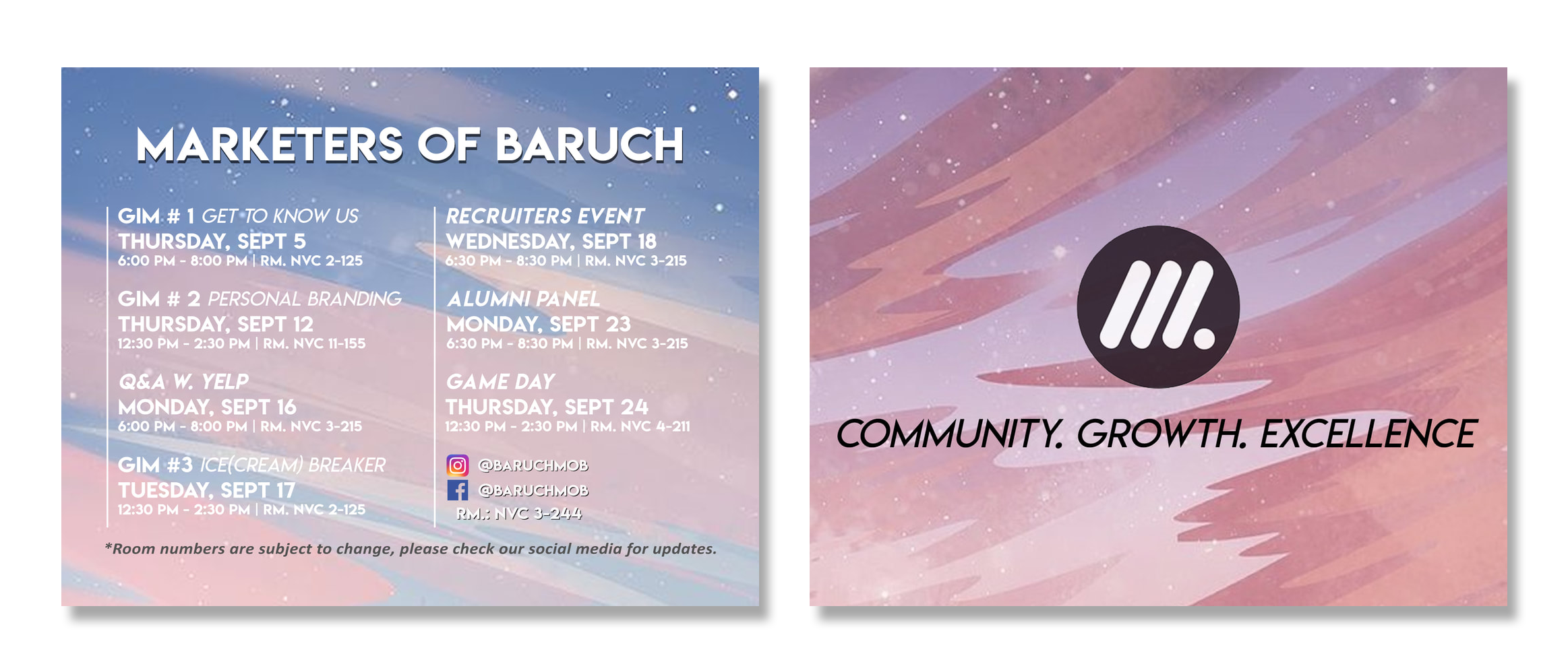
Postcards were also designed and printed to give out to students during convocation and club fair.
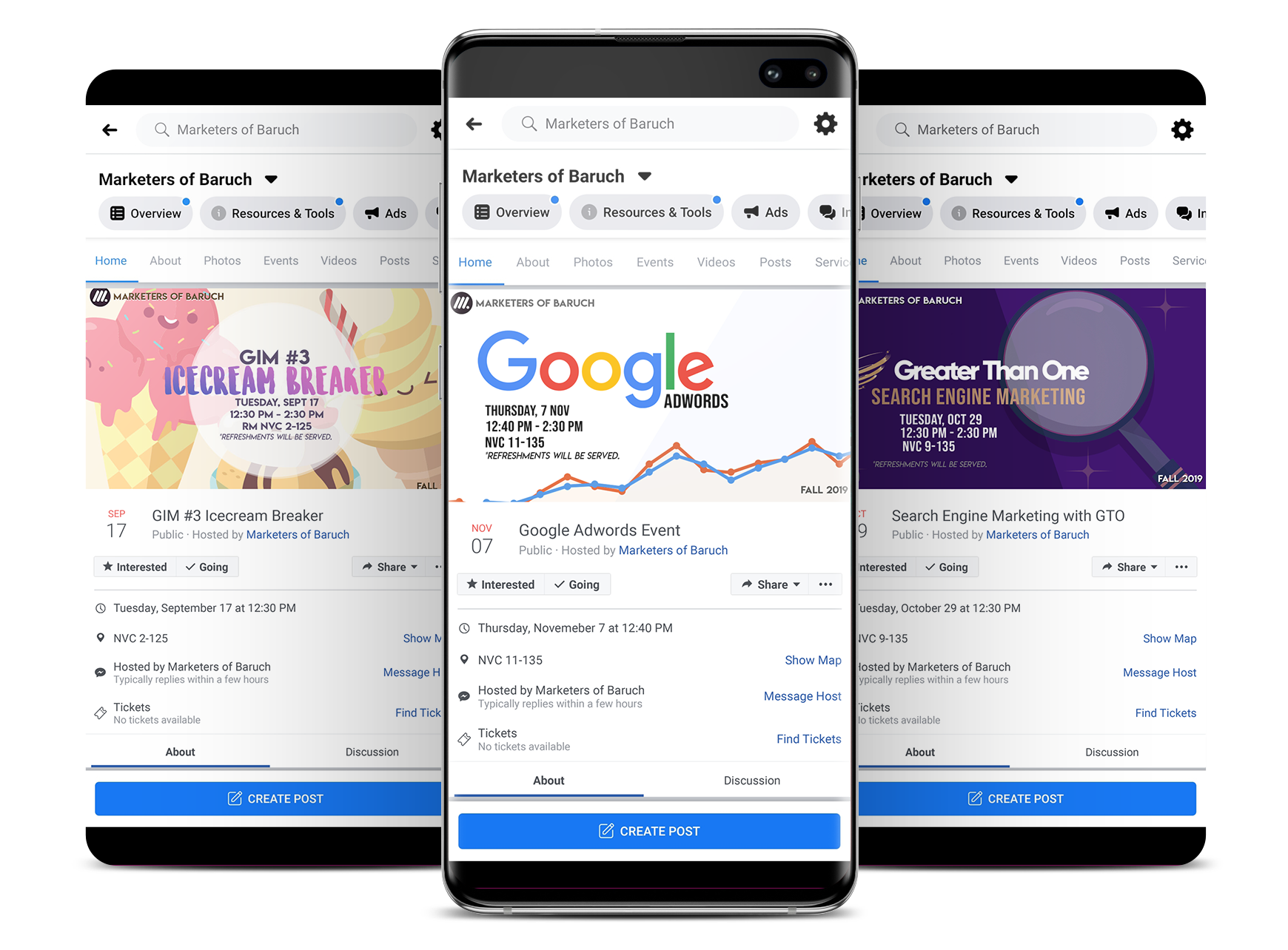


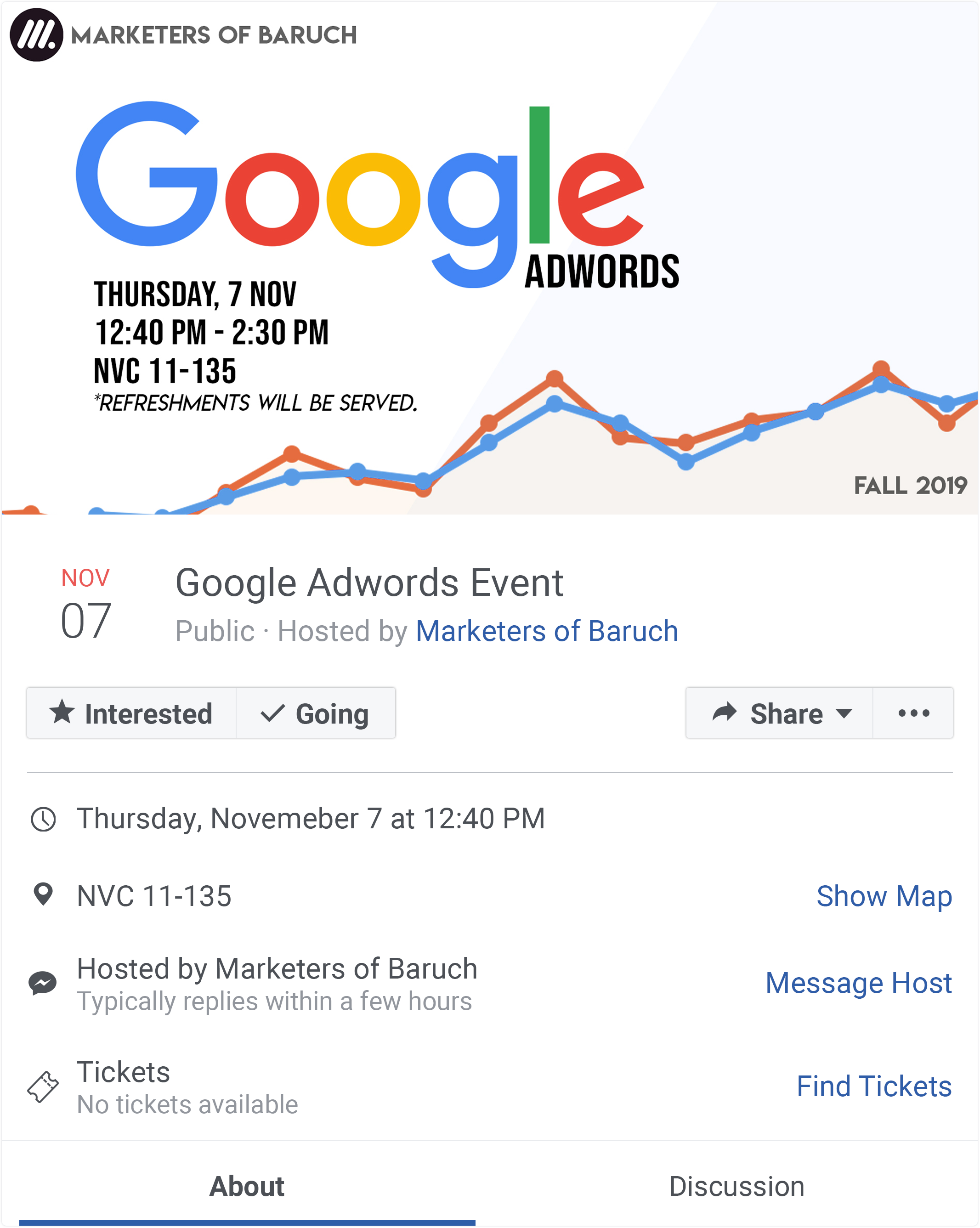
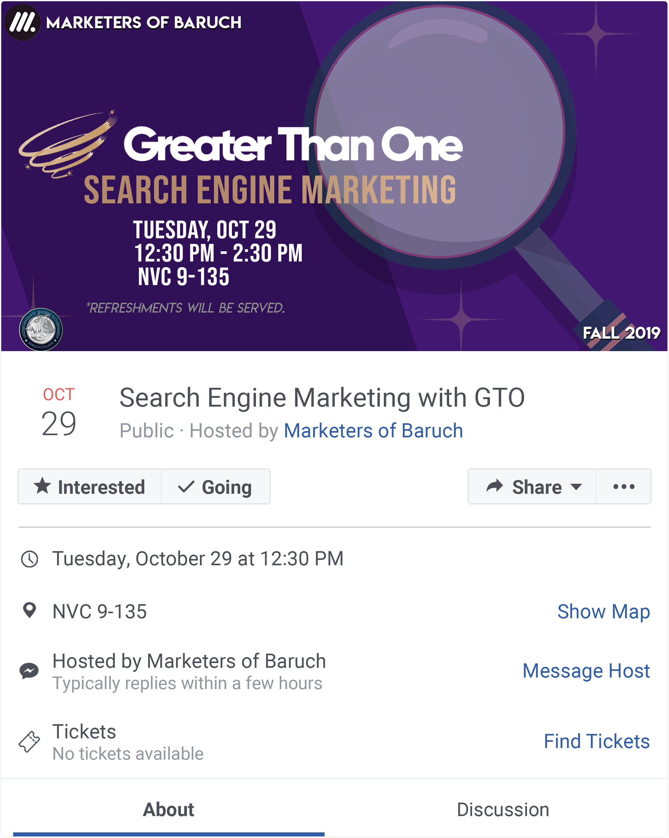

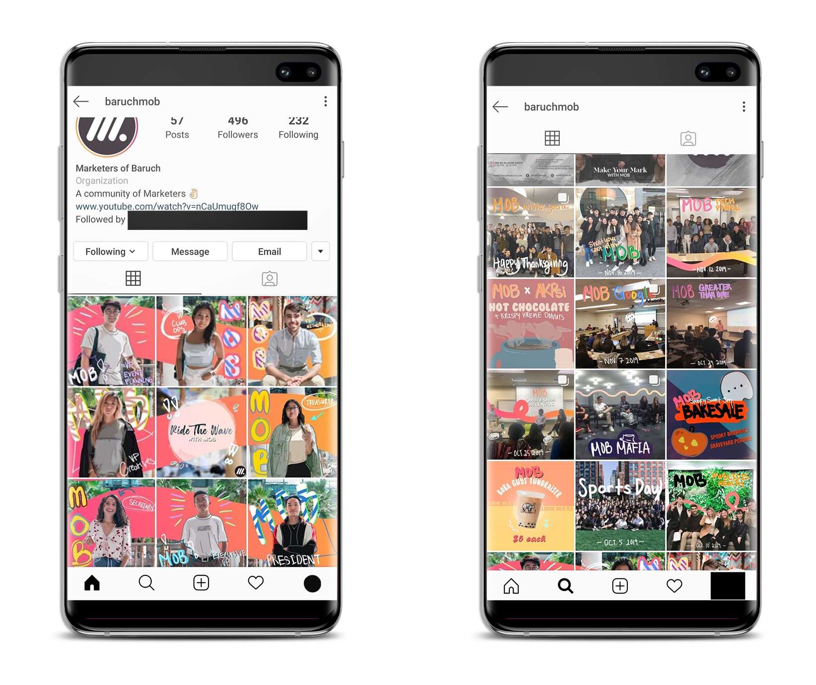
A consistent theme was kept throughout the Instagram feed within the Fall 2019 semester.
Since the beginning of recruitment, we have gained 40+ followers for the Fall 2019 semester.
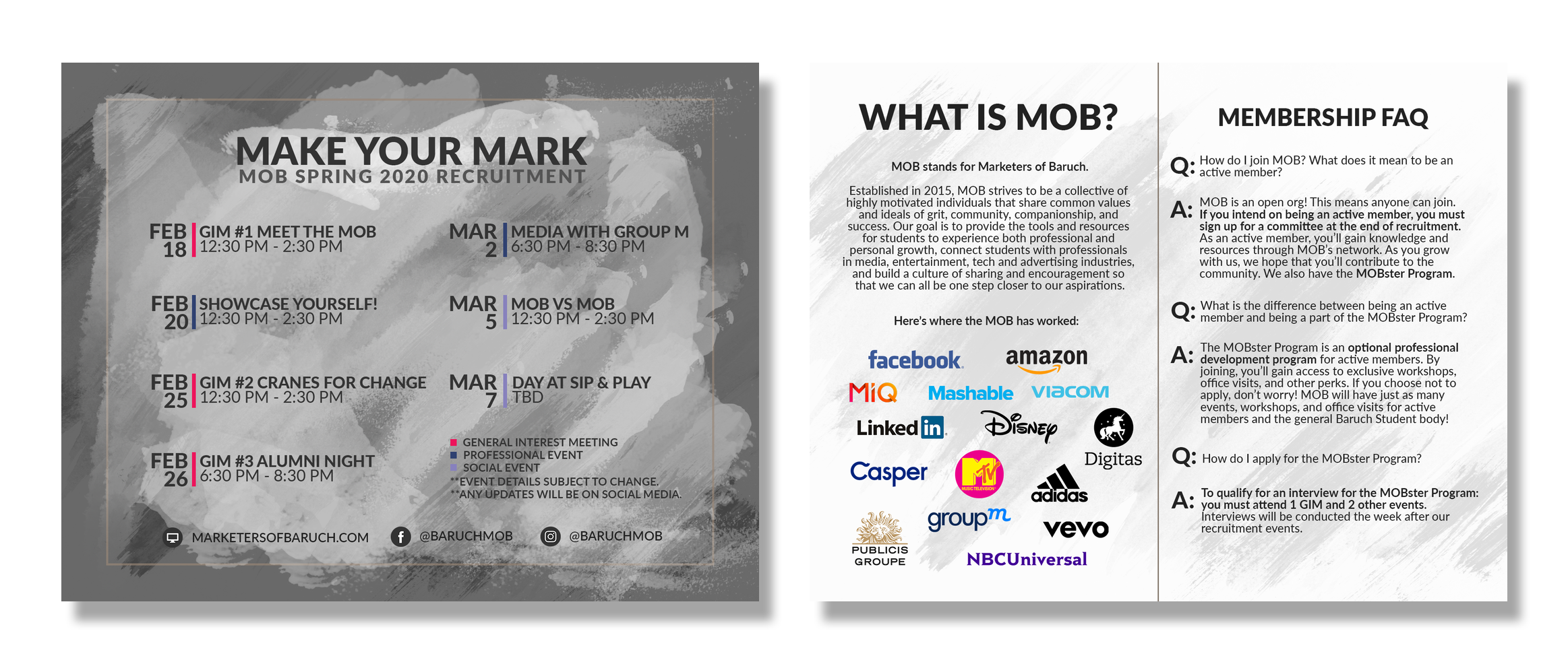
#MakeYourMarkWithMOB
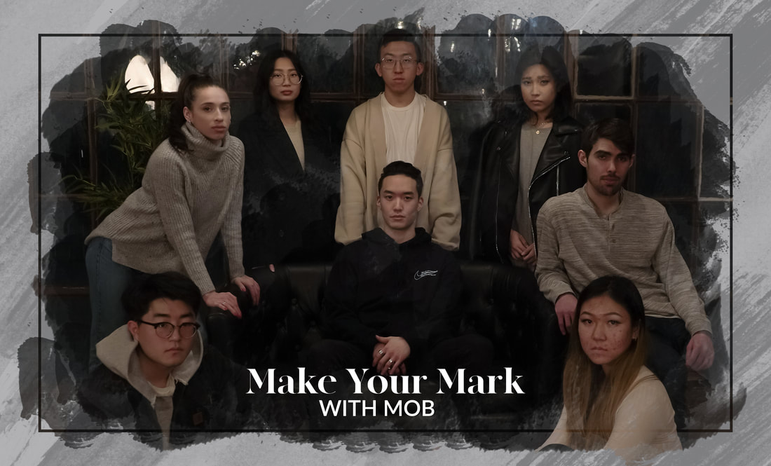
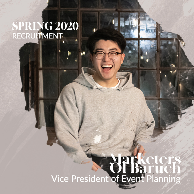

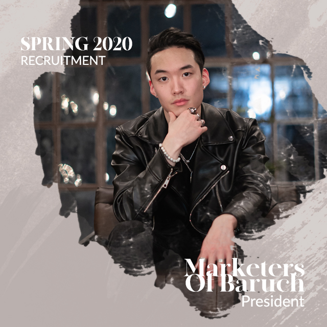
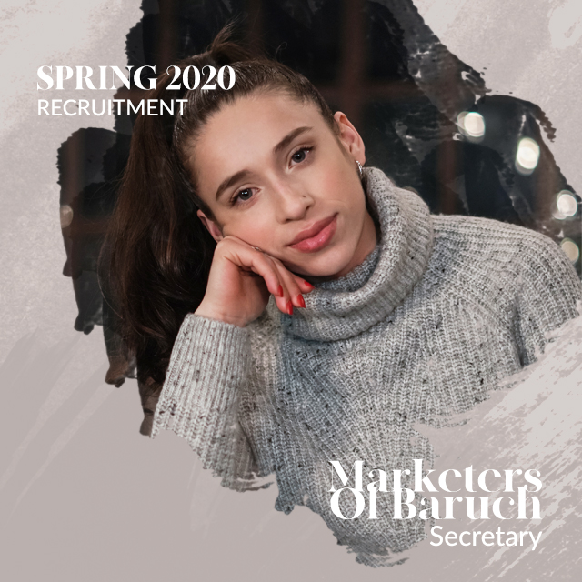


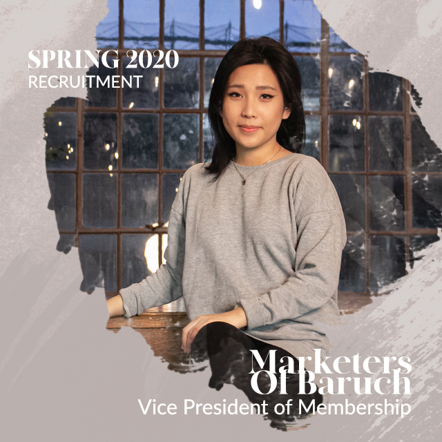

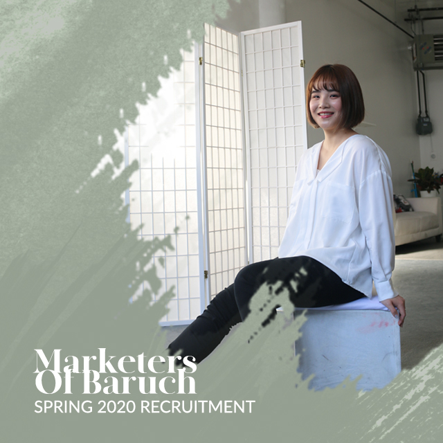


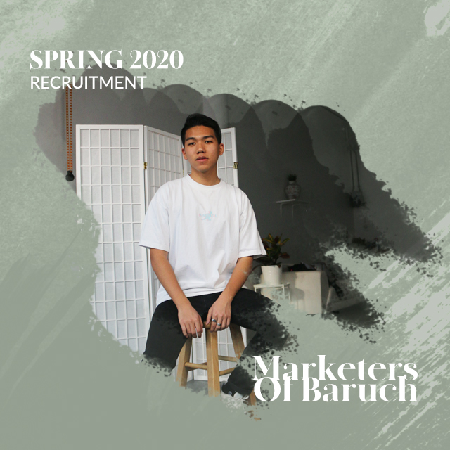
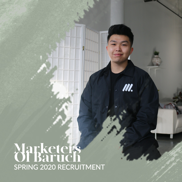

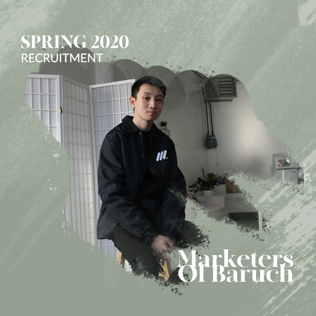
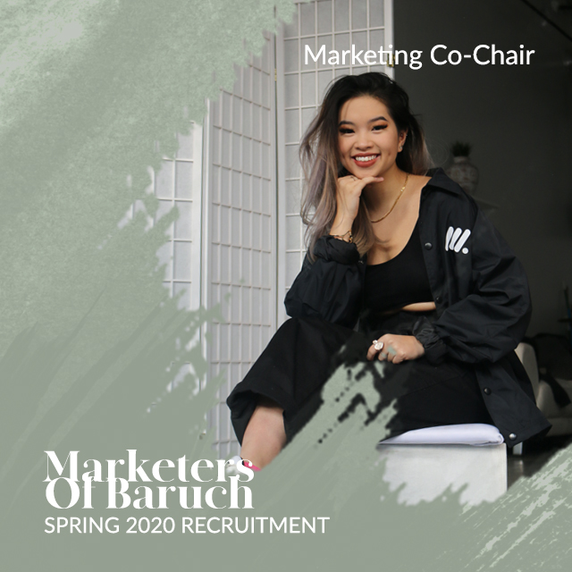
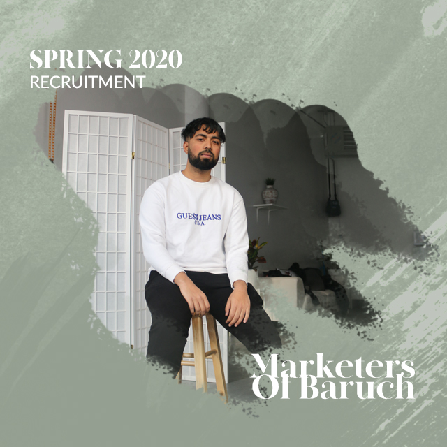

As our club grew in members, edited Facebook profile pictures have been opened up to our active members. Whoever was interested attended a photo-shoot and receive his or her very own Facebook profile picture.



Fall 2020
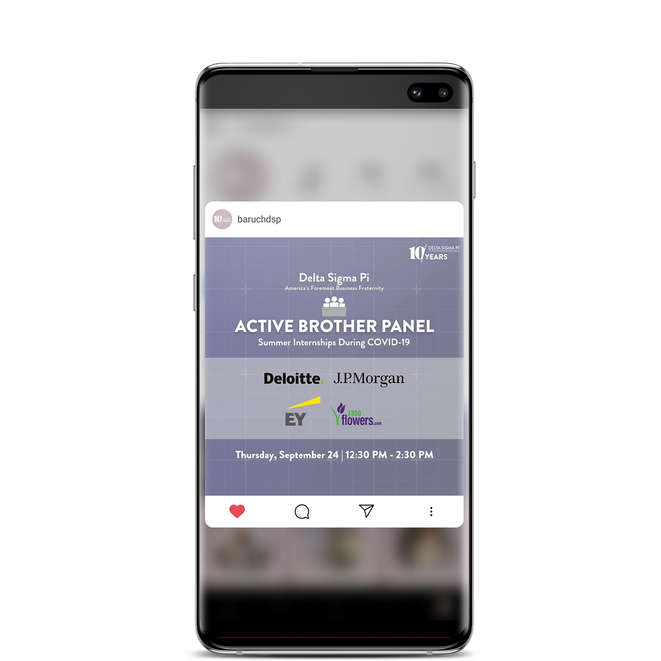
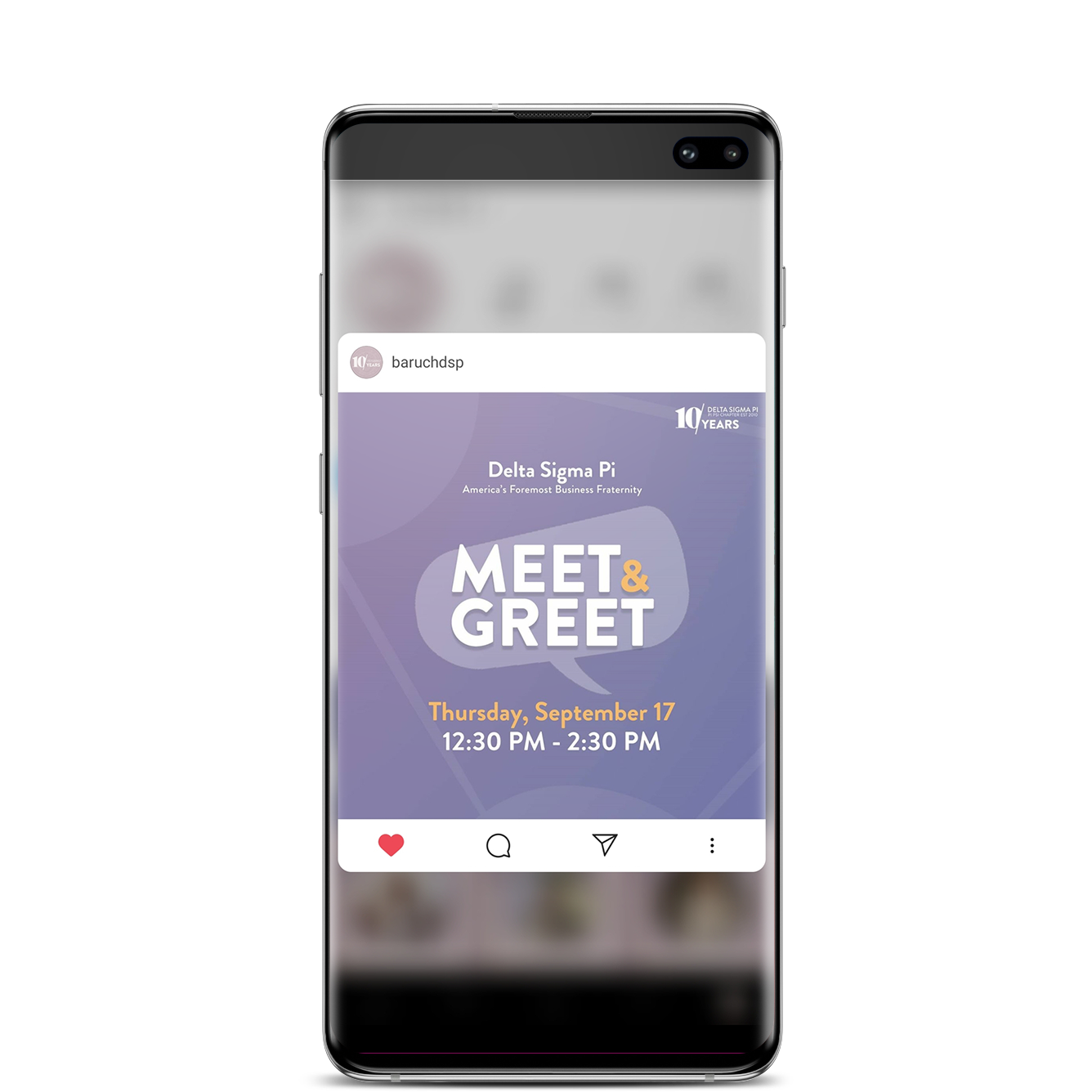
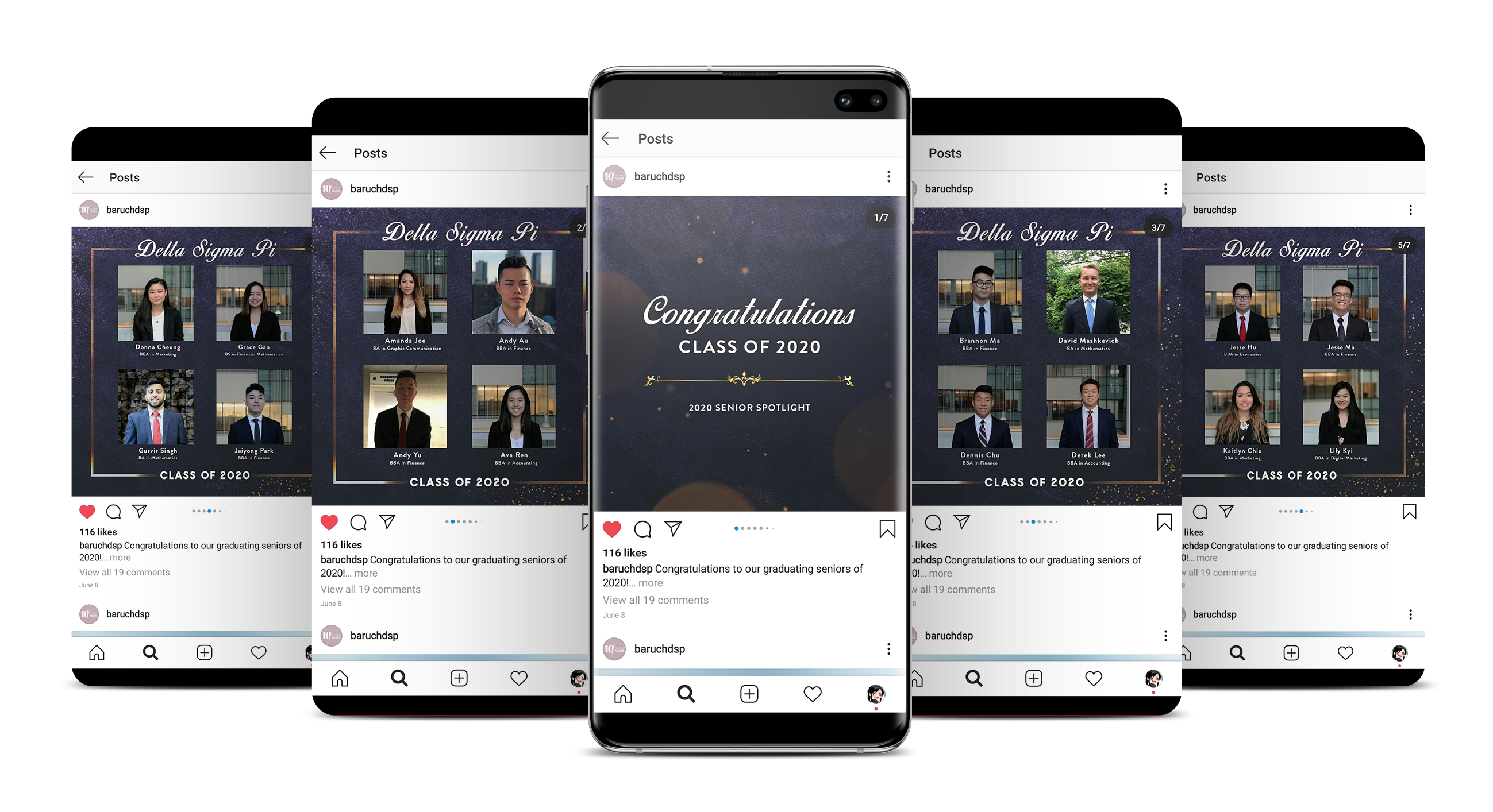
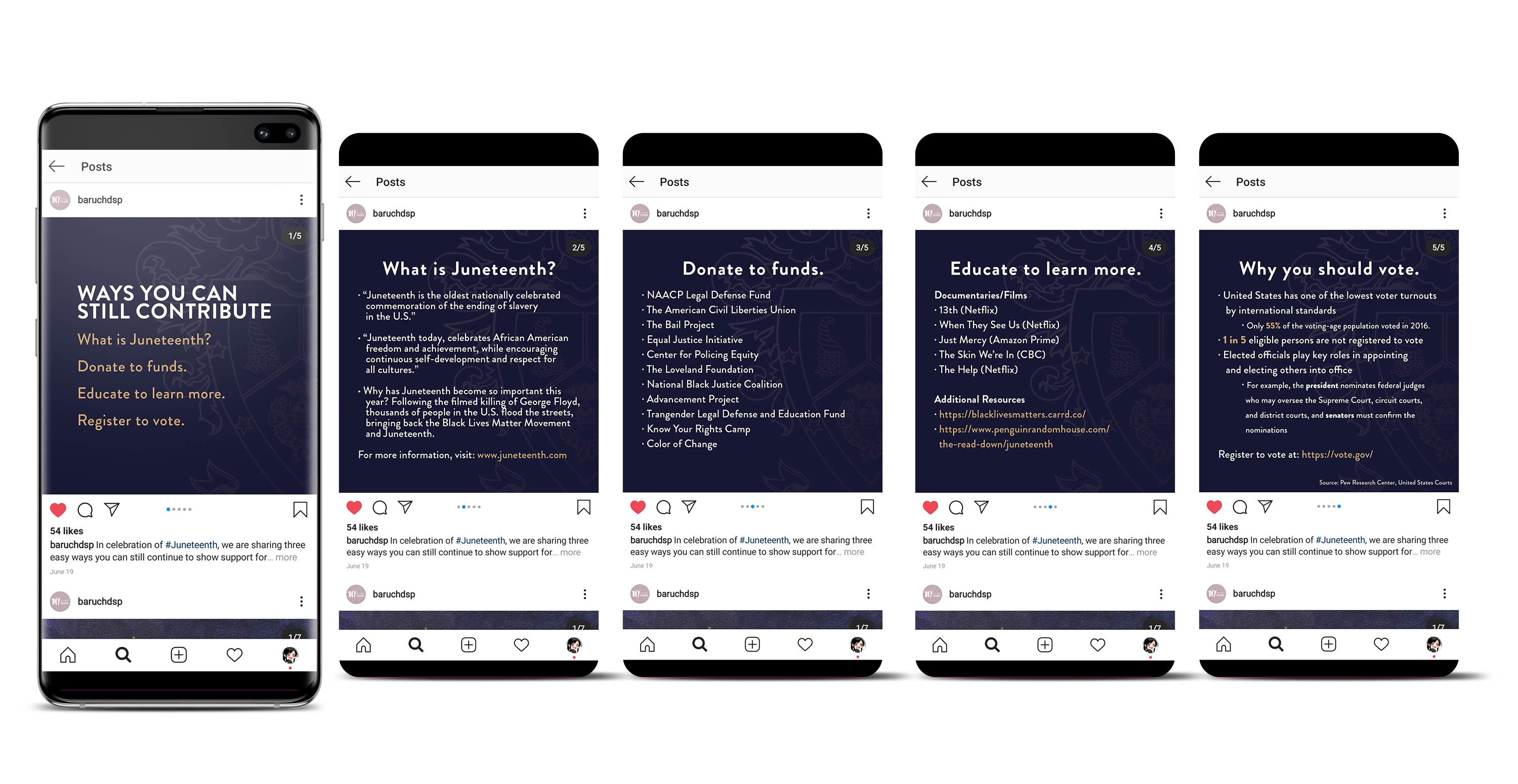
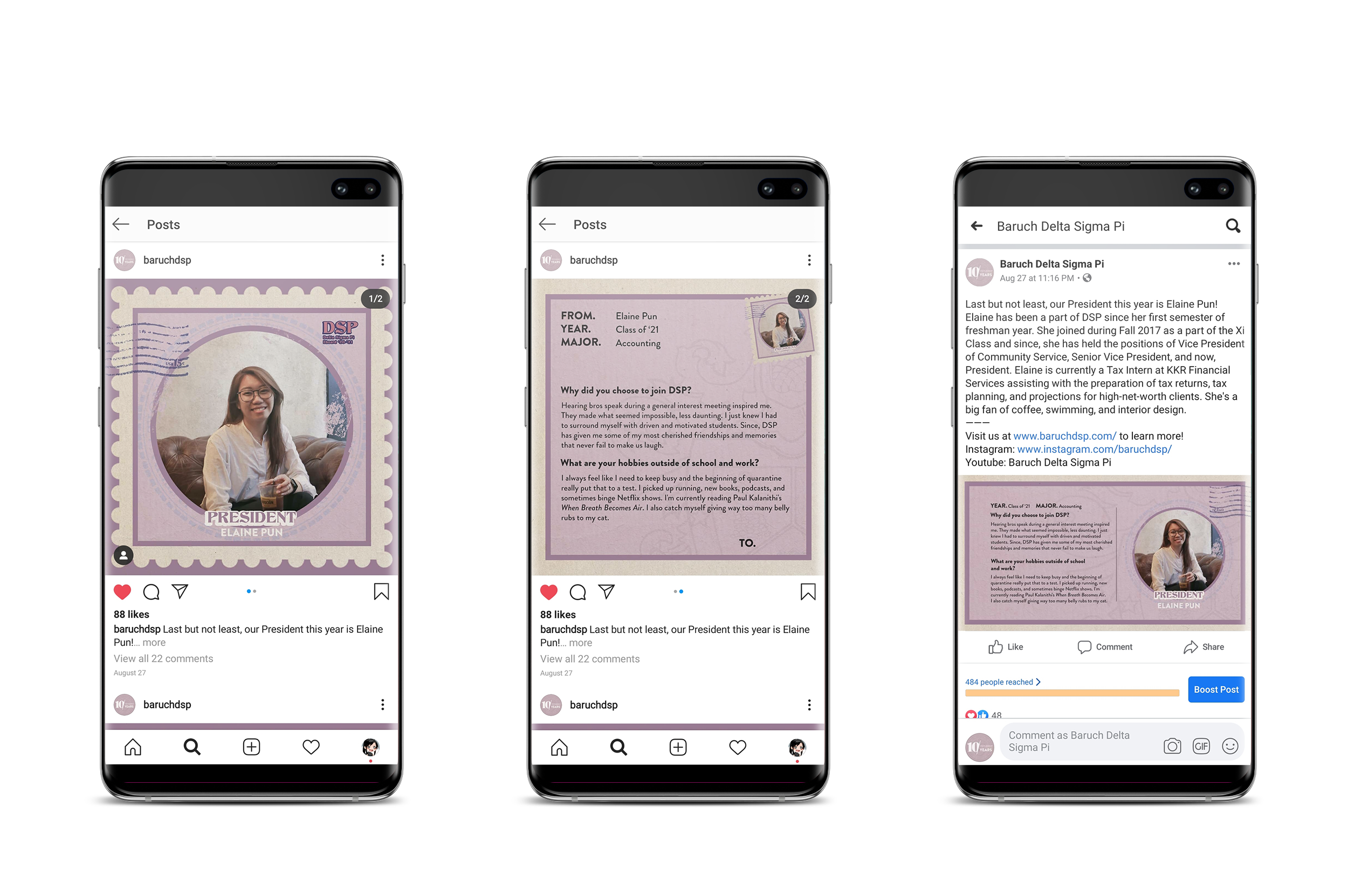 On both Instagram and Facebook, we announced the new executive board for the 2020-2021 school year. The 2020 year was our 10 year anniversary so we went for a vintage/stamp aesthetic to represent the throwback.

Summer 2020
Spring 2019
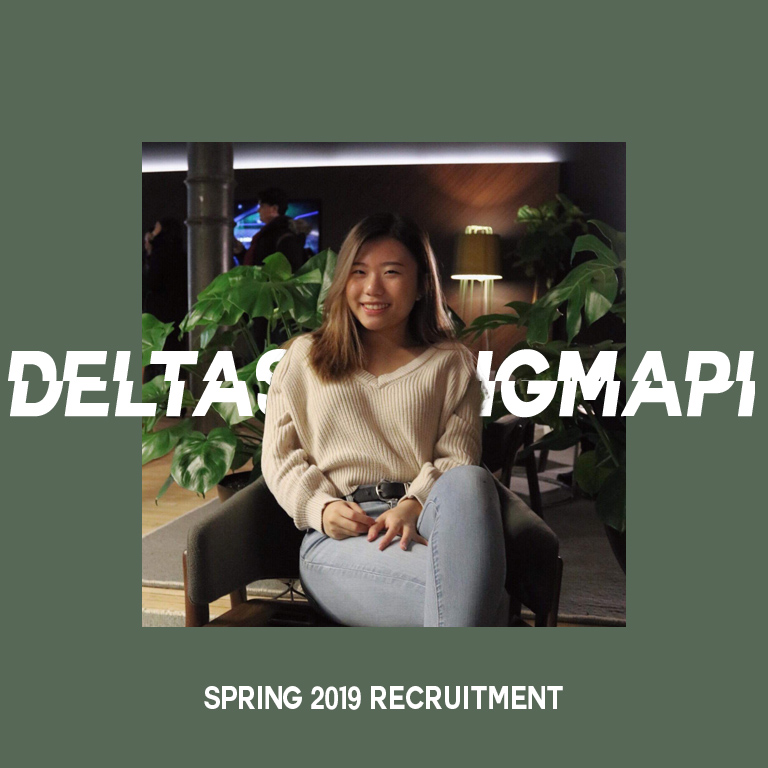
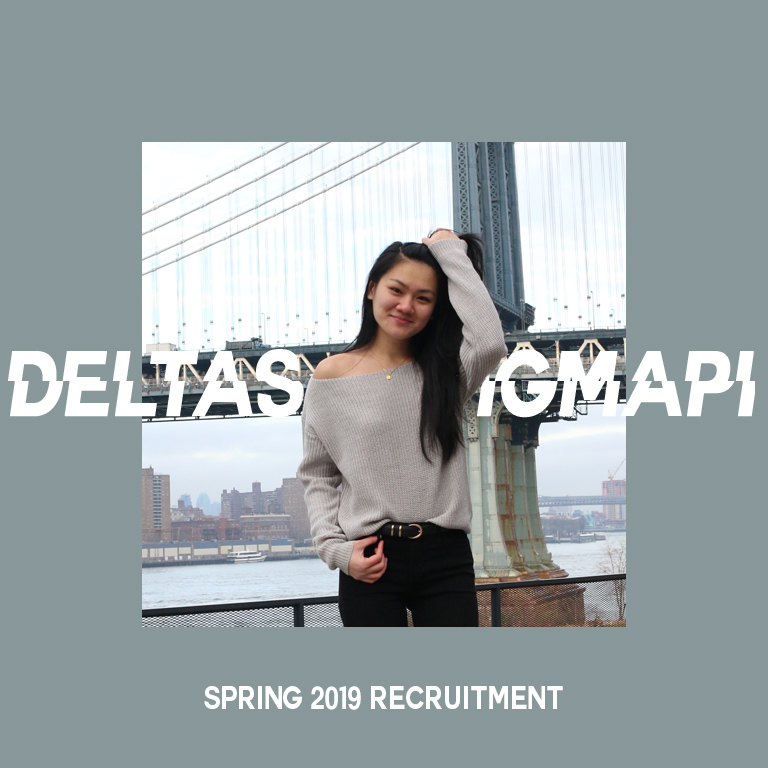
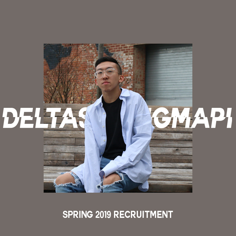
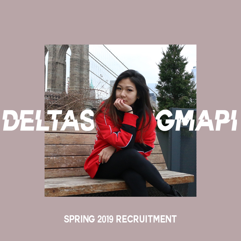
For Spring 2019, we decided on a more colorful theme to help diversify the majors within the fraternity.

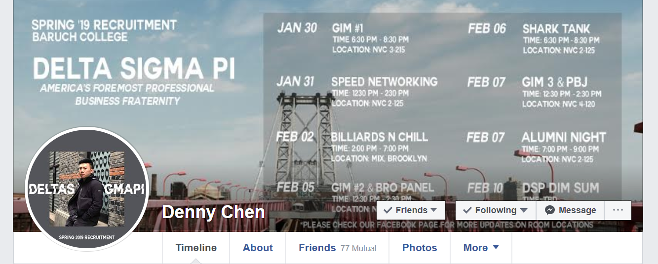
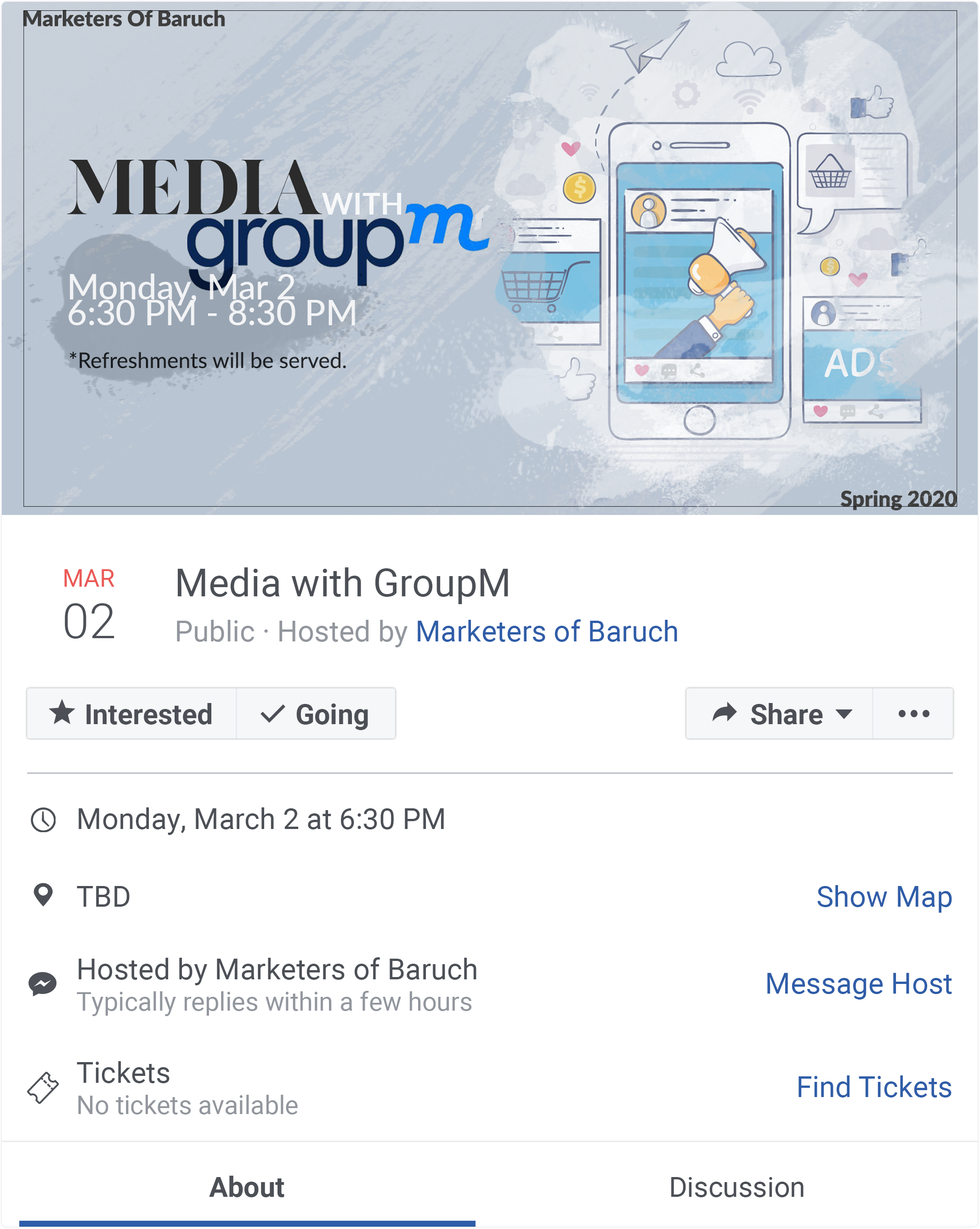
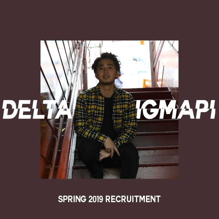
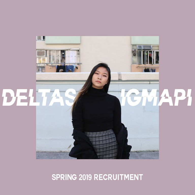
As we go live on social media, each brother of the fraternity change their profile pictures on Facebook, and also changing their cover photos to the event timeline. This is so we can be uniformed and spread awareness of our events on social media
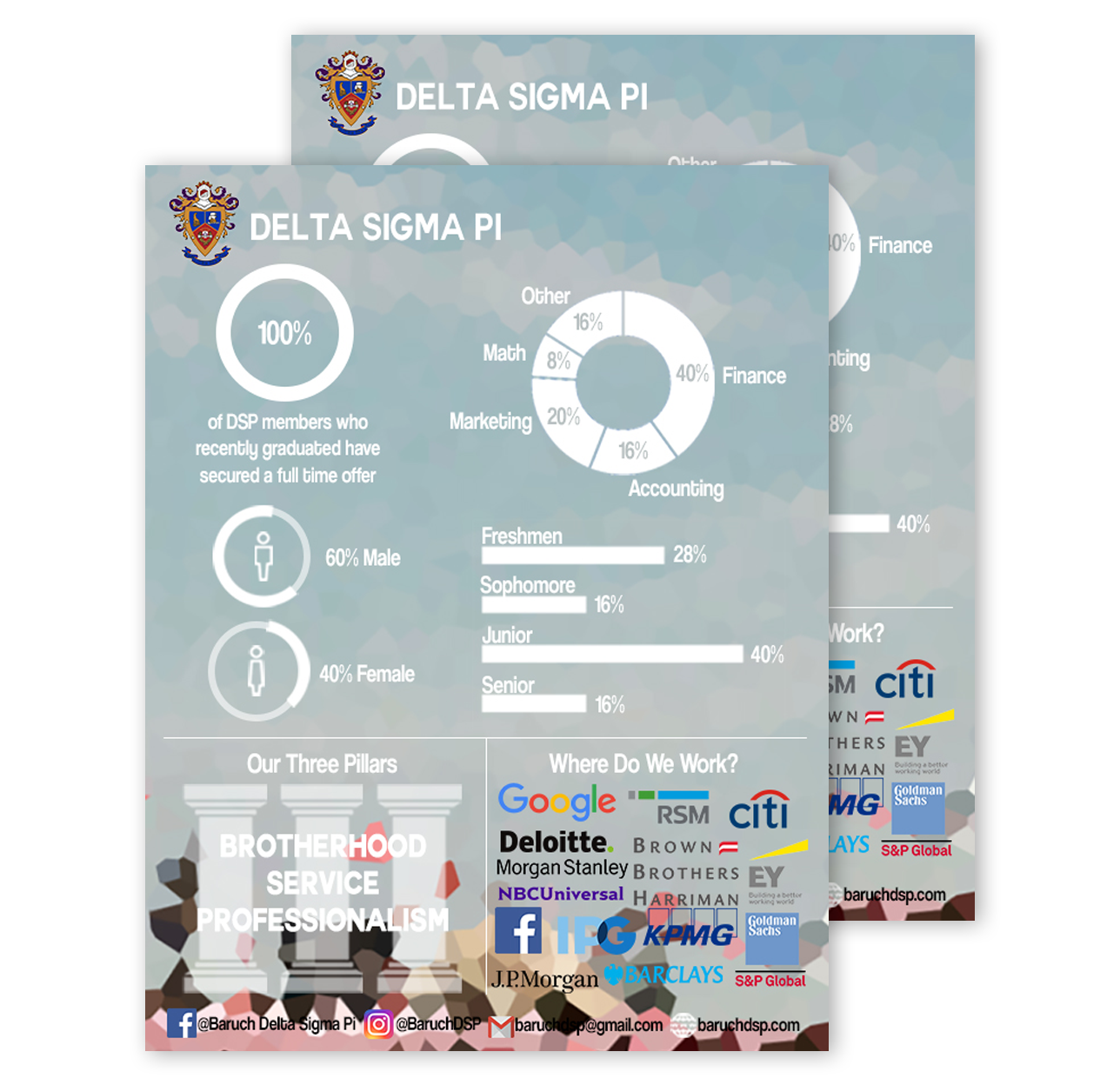





The infographic is presented and handed out to students throughout recruitment to help get a better idea of what the fraternity is composed of. The process started with surveying the current active body of brothers and communicating the data in a visual manner.
Project: Develop design variations of GDN and Instagram ads. Unable to fully showcase project due to confidentiality policies.

